I was inspired by simplicity for my website layout. Grey scale, with use of black and white, helps to create this atmosphere. Many artist websites follow this simple design. The true focus is on the artwork, therefore that should be the only picture in true color.
The inspiration for my website's purpose came from the notion of online stores and blogs. The interactive artwork on the index page will have roll-over links that takes the viewer to different "stores." Each component of the city scape drawing will lead to a store that is themed based upon the objects sold there. The site will not be a true store, but will be comprised of various objects that I find on other store sites. In this way, it is like an interactive blog. The viewer will be able to follow my inspiration for different "looks" for clothing and/or home decor.
Erin Wasson is not only one of my icons, her official website embodies an atheistic portrayed by the layout and color schemes. It is minimalist, with an artistic undertone due to her history in fashion. Many designer websites portray this "minimalist" attitude becuase the most important aspect is to show off the designed clothing and/or accessories.
Initial Page
The initial page that is viewed once searching for the site includes a black and white color scheme. Erin can be seen in a black and white fashion photograph as the background. On the borders of the page are "grunge" acid wash panels. Both the style of pose in the photograph and the acid wash panels portray Erin's fashion point of view. If one knows her style, she is into a southwestern, grunge type of look.
The heading is kept simple; a bold "ERIN" stretching across the top of the page. The spacing between each letter adds even more interest. Minimal links are located on the entire page.
Using the Links
When a link is selected, the "ERIN" heading and background do not change. It is only the picture that disappears and is replaced by a colored picture. Along the bottom is a scroll bar to pan through pictures. The scroll bar adds a new dimension to the page, moving horizontally instead of vertically. I believe that all this maintains the intended atheistic of "minimal." Choosing to display color pictures against a black and white background will make them "pop" more. This enhances the intended use of the website: to show off Erin's personality and work.
Vito Acconci recounts the evolution of public space as the conception of time has changed throughout our societal world. Public spaces have not only been restricted by policies and laws, but it has also expanded with the introduction of virtual space.
Within paragraph "9" Vito discusses the notion of two types of places: historical and virtual. He begins by explaining the evolution of the historical place. Clusters of individuals must move indoors to keep intact. These indoor settings can be commonly seen as bars, cafes, etc. People come to these places either for a service or to be part of a group. In many cases, on may come with the excuse of receiving a service, but the cluster is essentially brought together by the common service. What gives this place a sense of "place" is that it becomes distinguished from the surrounding places.
Historical places are preservation or recreations of the place it was previously. These places have time, time that is ultimate. In further distinction, Vito claims the historical place as equivalent to going home. In opposition, virtual spaces is equivalent to going on vacation. These places have no time. Yet, what is a place without time? In both cases, the place is linked with memory or imagination. The ultimate drive: companionship.
I had chosen a simplistic Ravens football logo in spirit of being a fan. I not only changed around the colors to make the eyes pop and become more intimidating, I expanded some of the points on the edges. I then added purple mock-flames to portray a border.
"Ghostly human bodies appear as casualties of the info-war in the city..." (Paolo Cirio)
Paolo Cirio is a media artist that dabbles in various fields. "Street Ghosts", specifically, is considered to be net-art. He is most notable for exploring the influence that information has on social, political, and economic factors. His work is meant to create a reaction (i.e. thought provoking) and it certainly does when legal consequences come his way. For example, in 2011, he "stole" 1 million Facebook profile pictures and republished them on a mock dating site, ordering them by facial expressions. Specifically, I wish to explore his work known as "Street Ghosts."
"Street Ghosts" is composed of people captured by Google's Street View cameras. They are reprinted as low-resolution, human scale posters. The images are intentional blurred as to create a "digital shadow." The printed posters are then posted on the walls in the original spot the picture was taken on the Street View camera. The art straddles two worlds: digital and real.
Paolo notes that Street Ghosts is intended to explore the boundaries of ownership when it comes to personal lives. It is a war between public and private. The pictures taken on Google are without the person's permission, invading on their privacy but somehow in a legal manner. Paolo is reversing this by using the images without Google's permission.
Street art is often in expression to a cause. Printed where all can see, it is a public statement and the artist may be well aware of the consequences. Paolo is no exception. His art may not be ascetically pleasing to the eye, but it packs in a statement....in public. Legal consequences may arise, but this only gains his work, and his view on society, more attention. Personally, "Street Ghosts" would be hard for me to grasp as a viewer unless I knew the background intentions of the project. I would more than likely pass by without even seeing it. Yet, maybe this is also part of Paolo's point. Many bystanders would also pass by these images, upholding the notion that they are "ghosts." In critique, I believe that by making the art larger than just human size would create a more noticeable effect. The viewer would, then, not be able to simply just pass by the image. They would be starring at a larger-then-life form, giving an omnipresent aesthetic.
A contemporary jazz song was played to inspire the class to create an piece based upon it. I immediately noticed the strong base beat, to which other instruments piled on top as the song progressed. The motion of the song reminded me of an underwater scene, but I did not want to go literal. I first created abstract bubbles to represent the base beat that started off the song. I then added a swirling pattern to mimic the song's smooth progression. Plants were then added as the string instruments picked up, but I wanted them to look faded so that it was cohesive with the rest of the image. I choose to use pastel colors to portray the "cool" feeling of the jazz song.
Portraits are a wonderful instrument to not only depict a person, but also his or her personality. The facial expressions produce emotions in which a viewer can immediately connect with. The above portrait is of the infamous Clint Eastwood. The bottom portraits are photo graphs of either myself of my friends.
The above photo was taken of myself during the Festival of Holi in Pondicherry, India. Hence, the bright colors.
Below is my signature that I then traced over using the pen tool in Illustrator. The original signature is in pink pen, while the tracing is in purple.
Below is a piece of line art that I had created in Illustrator. I wanted to keep it simple; starting with a simple right angle and then rotating it to make a different form. The forms are then pasted about the page in different sizes and different shades of grey.
Pascal Dombis is based out of Paris, France but exhibits shows throughout Europe, Asia, and the United States. In Lyon, he had earned an Engineering degree, which gives brief insight to the aesthetic of his artwork. Using the computer medium as a generator for his designs, Dombis produces chaotic images that purposefully represent unstable and irrational environments. His installations may include wall drawings, light boxes, or video.
The above image is entitled Antisana III and was produced as part of a collection in 2000. Upon closer look, recursion is purposefully used to create this organic-looking, large-scale "growth." Specifically, in Antisana, Dombis had taken broken ellipses and morphed them into different shapes and sizes, repeating his layering so many times that it is hard to tell the base unit. The digital line drawings were then presented as larger-than-life images.
As a viewer walks into the art-space, the digital image encompasses one wall, while the rest of the space is left completely blank white. The white walls further emphasize the digital image. Even more so, Dombis is playing with the notion of simple vs. chaotic, stable vs. unstable. This ideal becomes clear to the viewer as they begin to process the space.
His most recent work, entitled Eurasia, continues with his personal aesthetic of chaos. This specific installation creates as interactive space in which viewers enter the show room and are actually walking on it. Essentially, it covers the entirety of the floor. Composed of mass amounts of text set in close-knit lines and right angles, to the unfocused eye it can be perceived as a grey cloud. Yet, upon further look from the viewer, one can distinguish the specific lines of text.
For me, this installation is yet another example of opposites: chaos vs. order, stable vs. unstable. It is left up to the viewer to unravel its mysteries and contemplate what it may mean to them. With digital line drawings the artist wants to invoke a message or feeling through vision, yet with an installation that includes text, the importance of visual design is matched with the importance of interactive reading. Therefore, there are now two modes in which a viewer can make meaning of a piece.
I, personally, found Pascal Dombis to be inspirational. His artistic vision matches my own. The images and installations seem so simple and so streamline. Yet, instability and chaos are their main medium. Not only are they pleasing to look at, but deep meaning perpetuates even deeper thought.
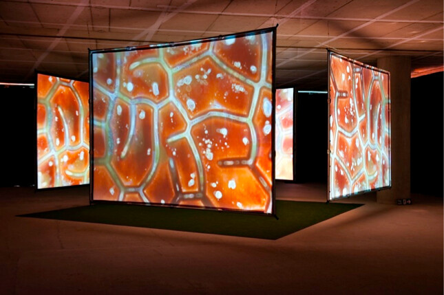
Anthony Aziz and Sammy Cucher created "Synaptic Bliss: Villette Numerique 2004," as it states in the title, in 2004. It was exhibited in Parc de la Villette, Paris. The artists had been working together since 1991 and are based in Brooklyn.
The piece consists of a 4 panel installation that projects both video and audio. One can only imagine standing in the midst of these 4 large panels, surrounded by images of micro-biologic nature. The artists intend to create a world that verges on the boundaries of polar opposites. This includes organic and digital, micro and macro.
I believe that they succeeded in portraying their intentions. If one stands in the center of the installation, the rest of the world is mostly blocked out by these 4 massive screens. One is transported into micro, organic workings, yet can not deny that the images are created in a digital format. I believe that a sense of curiosity is also given. A viewer, unless extremely versed in micro biology, will not know what organism these micro portions belong to. I could imagine interacting with this piece for a long period of time, possibly with a quizzical look upon my face.
As far as critiques go, I appreciate the work that went behind this installation. It creates a space for the audience to enter, therefore bringing a great deal of viewer interaction into play. Yet, I believe the piece would have worked better in an all white room, allowing the viewer to totally ex-communicate the surroundings beyond the screens.
Our latest project was to create sketches that portray our view on how digital technology influences us and our world. Below are two pieces that I created in Photoshop.
The first depicts a women wearing sunglasses. The lenses of the sunglasses were replaced with the login screen of Facebook. "Labeled" is written on her forehead to represent how kids, young adults, and adults may be labeled due to their posts or activity on the digital network.
Here, I choose to portray old vs. new. The combination creates a comedic effect. A cell phone and text have been incorporated to play on the idea of texting at the dinner table and a parent's reaction.


